- August 04, 2025
Summarize with AI
Not enough time? Get the key points instantly.
Get summary:
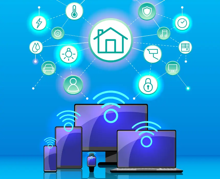
What is different between normal dashboards vs IoT dashboards?
The demo dashboard always looks clean. Smooth charts, live updates, a map with device pins. Then real devices connect devices that go offline unexpectedly, send duplicate readings, transmit values outside the expected range, and flood the pipeline at 50 messages per second when the spec said five. The dashboard that worked perfectly in the demo starts dropping data, showing stale readings, and becoming the thing your team apologises for in every client call.
While normal dashboards are not complex and physical device connected hence there is less technical complexity on data visualization and data fetching.
Most IoT dashboard failures are architecture failures, not tool failures. The tool stack was chosen before the data behaviour was understood. This post walks through how to build an IoT dashboard that handles real device data including the architecture decisions that determine whether your dashboard scales, the tool options at each layer, and the single most common mistake that makes production IoT dashboards unreliable.
Why Most IoT Dashboards Fail Before They're Useful
The gap between a demo dashboard and a production dashboard comes down to one thing: real devices behave nothing like simulated data.
Simulated data arrives at perfect intervals. Real BLE sensors drop packets when the phone moves. Real cellular devices go offline for 20 minutes when a truck drives through a dead zone. Real industrial sensors send the same reading 40 times in a row when a register gets stuck. Real temperature probes send -999 when the thermocouple disconnects.
A dashboard that can't handle these situations doesn't fail gracefully - it shows wrong data confidently. That is worse than showing no data. A nurse looking at a patient monitor that displays a stale reading without flagging it as stale is in a more dangerous position than one looking at a screen that says "no data."
When you build an IoT dashboard, the architecture needs to address three failure modes before the first device connects:
Intermittent connectivity. Devices go offline. The dashboard must distinguish between "device is offline" and "device is reporting a normal value" and communicate the difference clearly.
Out-of-order and duplicate messages. MQTT over cellular does not guarantee ordered delivery. A temperature reading timestamped 3 minutes ago can arrive after a reading timestamped 2 minutes ago. A dashboard that renders in arrival order shows a chart that spikes backward in time.
Data volume spikes. A device misconfiguration, a firmware bug, or a network retry loop can flood your pipeline with thousands of messages per second. A dashboard architecture without ingestion buffering will drop data or crash under load.
These three problems have architectural solutions. The tool you pick matters less than whether the architecture addresses them.
The 4-Layer IoT Dashboard Architecture That Actually Works
Every reliable IoT dashboard and knowing how to build an IoT dashboard that lasts - starts with four distinct layers. Teams that collapse these layers into fewer components , usually to ship faster and consistently hit problems at scale.
Layer 1 : Ingestion
The ingestion layer is the first point where device messages enter your system. Its job is to accept messages at any rate, buffer them, and pass them downstream without losing data.
The standard protocol is MQTT. MQTT is a publish-subscribe protocol designed for constrained devices and unreliable networks. It uses a broker which is a server that receives messages from devices and delivers them to subscribers. The three most common broker choices are:
Broker | Best for | Hosted option | Scale ceiling |
|---|---|---|---|
Mosquitto | Local and small scale deployments | Self hosted only | Tens of thousands of connections |
HiveMQ | Enterprise, high reliability | HiveMQ Cloud | Millions of connections |
AWS IoT core | AWS native deployments | Fully managed | Millions of connections |
EMQX | High throughput industrial | EMQX cloud | Millions of connections |
VerneMQ | Distributed deployments | Self hosted | Horizontal scaling |
The ingestion layer must handle MQTT QoS levels correctly. QoS 0 (at most once) is fire-and-forget appropriate for high-frequency sensor data where a missed reading doesn't matter. QoS 1 (at least once) guarantees delivery but may result in duplicates the dashboard must handle deduplication. QoS 2 (exactly once) guarantees single delivery but adds overhead - appropriate for commands and configuration changes, not for sensor telemetry at high frequency.
Layer 2 : Processing
Raw device messages are not dashboard-ready. They need to be validated, transformed, deduplicated, and enriched before storage. The processing layer does this work.
Validation catches out-of-range values before they reach the database. A temperature reading of -999 from a disconnected thermocouple should be flagged as an error reading, not stored as a valid data point and displayed on a chart.
Deduplication removes duplicate messages. MQTT QoS 1 can result in the same message delivered multiple times. A processing layer that checks message IDs or timestamps against a short-lived cache can discard duplicates before they hit the database.
Enrichment adds context that the device doesn't transmit. A device sends a temperature reading. The processing layer adds the device name, location, unit, owner organisation, and alert thresholds from a configuration store. The raw value becomes a meaningful data point.
Common tools for the processing layer: Node-RED for visual flow-based processing, Apache Kafka for high-throughput stream processing, AWS Lambda for serverless event-driven processing, or a custom service. Node-RED is the fastest to set up and appropriate for moderate data volumes. Kafka is the right choice when message volume is high and processing reliability is non-negotiable.
Layer 3 : Storage
IoT data has two distinct access patterns that typically require two different storage systems.
Time-series storage is for sensor readings temperature, pressure, humidity, GPS coordinates, battery voltage. Time-series databases store and retrieve data indexed by timestamp extremely efficiently. They also handle downsampling automatically - aggregating 1-second readings into 1-minute averages for the historical view without storing every raw reading forever. The leading options are InfluxDB (purpose-built for time-series IoT data), TimescaleDB (time-series extension on PostgreSQL), and Amazon Timestream (managed, AWS-native).
Relational storage is for everything that isn't a reading - device registry, user accounts, alert configurations, asset metadata, organisation structure. PostgreSQL handles this layer for most IoT dashboards. The temptation is to put everything in one database. The consequence is a PostgreSQL database with a table of 50 million sensor readings that causes every query to slow down as data accumulates.
Storage type | What it stores | Best options | Avoid |
|---|---|---|---|
Time series | Sensor readings | InfluxDB, TimescaleDB, Timestream | PostgreSQL for raw readings |
Relational | Devices, users , config, metadata | PostgreSQL, MySQL | Time series DB for structured data |
Cache | Latest reading per device | Redis | No cache at high device count |
The cache layer deserves specific attention. A dashboard displaying the latest reading from 10,000 devices cannot query the time-series database for 10,000 latest values on every page load. A Redis cache that stores the latest reading per device and is updated on every ingested message turns that 10,000-query problem into a single cache lookup.
Layer 4 : Visualisation
The visualisation layer is what users see. It is also the layer most teams spend the most time choosing and it matters least if the first three layers are broken.
Two approaches dominate production IoT dashboards:
Custom front-end (React, Vue, or Angular with a charting library) gives full control over UI design, user experience, and business logic. For any IoT product where the dashboard is user-facing , which is the right approach. A custom front-end means the dashboard looks like your product, not like a generic analytics tool. It means the UX is designed around what your users actually need to see, not around what the analytics platform is capable of rendering. And it means the data display can evolve as the product evolves, without being constrained by what a third-party tool's panels support.
The core elements of a custom IoT dashboard front-end:
Charting layer : a purpose-built charting library (Recharts, Chart.js, Highcharts, or D3 for highly custom visualisations) connected to your time-series API
Real-time layer : WebSocket connection to a backend that pushes new readings as they arrive, so the chart updates without the user refreshing
State management : a centralised store (Redux, Zustand, or similar) that holds device state, latest readings, and connection status for the whole dashboard
API layer : REST endpoints for historical data queries and WebSocket or Server-Sent Events for live updates
The visualisation layer is where the product lives for your users. It deserves the same engineering investment as the data pipeline behind it.
Criterion | Custom front end | Off the shelf tool |
|---|---|---|
UI/brand control | Full - designed to spec | Constrained by platform panels |
Multi tenant support | Built to your data model | Plugin based , limited isolation |
White label ready | Yes | Rarely |
UX for non technical users | Designed for your audience | Built for technical users |
Custom interactions | Unlimited | Limited to platform features |
Maintenance | Team owned, evolves with product | Vendor upgrade dependency |
Time to first working version | Days to weeks | Hours |
The One Mistake That Makes Every IoT Dashboard Useless in Production
Teams that learn how to build an IoT dashboard focus intensely on the visualisation layer, which chart type, which colour scheme, how to arrange the panels. The mistake that consistently makes production dashboards useless has nothing to do with visualisation. It is this:
Displaying data without displaying data quality.
A chart that shows a flat line could mean the temperature has been stable for six hours. It could also mean the device went offline six hours ago and the dashboard is showing the last known value with no indication that it's stale. A user looking at both scenarios sees the same thing. They make decisions based on what the chart shows. One of those decisions is based on real data. The other is based on a device failure that the dashboard is silently hiding.
The solution is not complex , it is disciplined.
Every dashboard panel that displays device data must also display:
Last seen timestamp : when did this device last transmit?
Connection status : is the device currently online, offline, or in an unknown state?
Data freshness indicator : is the displayed reading current, or is it the last known value from a device that is now offline?
A temperature gauge showing 22.4°C with a green "online" badge and a "last updated 14 seconds ago" label communicates something completely different from a temperature gauge showing 22.4°C with a red "offline" badge and a "last updated 6 hours ago" label, even though the number is identical.
This distinction requires one architecture decision: the ingestion layer must track device heartbeat separately from data readings. When a device stops transmitting, the heartbeat tracking detects the absence and updates the device status independently of whether a new reading has arrived. Most teams implement this only after a user reports that the dashboard showed a device as active when it had been offline for hours.
How to Choose Your IoT Dashboard Stack: A Decision Framework
Run through these five questions before choosing your tool stack. When learning how to build an IoT dashboard, the answers narrow the choice significantly before you write a single line of code.
Question 1 : How many devices and what message frequency?
Under 1,000 devices, under 10 messages/second per device → Mosquitto + Node-RED + InfluxDB + React front-end
1,000–50,000 devices, moderate frequency → HiveMQ or AWS IoT Core + Node-RED or Lambda + TimescaleDB + React or Vue front-end
50,000+ devices or high-frequency industrial → EMQX + Kafka + InfluxDB or Timestream + custom React front-end with WebSocket
Question 2 : Who uses the dashboard?
Internal team, technical users → Lightweight custom dashboard with fewer UX layers
Customers, end-users, non-technical audience → Full custom front-end with purpose-built UX
Question 3 : Is multi-tenancy required?
Single organisation → Single-tenant data model with simplified access control
Multiple customer organisations with data isolation → Tenant-aware API with per-organisation data scoping built into the front-end
Question 4 : What is your cloud infrastructure?
AWS-native → AWS IoT Core + Timestream + React front-end via API Gateway
Cloud-agnostic → MQTT broker + InfluxDB + custom front-end against a REST/WebSocket API
Question 5 : What real-time update frequency do you need?
Updates every 30 seconds or slower → REST polling from the front-end is sufficient
Updates every 1–10 seconds → Server-Sent Events from your backend API
Sub-second or continuous streaming → WebSocket connection with a push architecture
Build the Architecture Before You Choose the Tools
The answer to how to build an IoT dashboard is not a tool name. It's an architecture decision: four layers, each with a specific job, chosen for the device count and data behaviour of your specific product.
The visualisation layerst decision to make, not the first. Build the ingestion layer to handle device behaviour, not simulated data. Build the processing layer to validate and deduplicate before storage. Build the storage layer with two databases, not one. Then choose the visualisation layer that fits your users.
And before you show a single chart to a user, make sure the chart communicates data quality, not just data. A dashboard that shows stale data without flagging it is not a monitoring tool. It is a false confidence machine.
If you are building an IoT product and need a dashboard that handles real device behaviour - CoreFragment builds full-stack IoT products including device firmware, cloud pipeline, and front-end dashboards. We're happy to review your current architecture and tell you where the gaps are before your first device connects.
Build the Architecture Before You Choose the Tools
The answer to how to build an IoT dashboard is not a tool name. It's an architecture decision: four layers, each with a specific job, chosen for the device count and data behaviour of your specific product.
The visualisation layerst decision to make, not the first. Build the ingestion layer to handle device behaviour, not simulated data. Build the processing layer to validate and deduplicate before storage. Build the storage layer with two databases, not one. Then choose the visualisation layer that fits your users.
And before you show a single chart to a user, make sure the chart communicates data quality not just data. A dashboard that shows stale data without flagging it is not a monitoring tool. It is a false confidence machine.
If you are building an IoT product and need a dashboard that handles real device behaviour - CoreFragment builds full-stack IoT products including device firmware, cloud pipeline, and front-end dashboards. We're happy to review your current architecture and tell you where the gaps are before your first device connects.
Frequently Asked Questions About How to Build an IoT Dashboard
What is the best tool stack to build an IoT dashboard?
There is no universal best stack. The right choice depends on device count, message frequency, user type, and real-time requirements. For most IoT products at moderate scale, a proven starting stack is an MQTT broker (HiveMQ or Mosquitto) for ingestion, Node-RED for processing, InfluxDB for time-series storage, Redis for latest-value caching, and a React front-end consuming a WebSocket API for live updates and a REST API for historical queries. The front-end is always custom - because the dashboard is part of the product, and a generic analytics tool cannot deliver the UX your users need or the brand experience your product requires.
What protocol should IoT devices use to send data to a dashboard?
MQTT is the standard for device-to-dashboard communication in most IoT products. It is designed for constrained devices, works well over unreliable networks, and uses a publish-subscribe model that decouples device data from the dashboard front-end. HTTP REST is an alternative for devices with reliable connectivity and low message frequency - a device that sends a reading every 10 minutes can use HTTP without the overhead of a persistent MQTT connection. WebSocket is appropriate for bidirectional communication where the dashboard needs to send commands back to devices.
How do you handle real-time data updates in an IoT dashboard?
Real-time data delivery from the server to the dashboard front-end uses one of three mechanisms. WebSocket provides a persistent bidirectional connection and is the standard for dashboards that update at high frequency. Server-Sent Events delivers server-to-client updates over HTTP without a full WebSocket - appropriate for dashboards that display live data but don't need to send data back to the server. Polling — the front-end requests new data on a timer is the simplest to implement and appropriate for dashboards that update every 30 seconds or more. WebSocket is the right choice for any dashboard showing live sensor data that changes faster than once every 10 seconds.
How do you display data from 10,000 IoT devices on a dashboard without performance problems?
The key is separating the latest-value problem from the historical-data problem. For displaying the current state of 10,000 devices - a map with device status, a table of latest readings use a Redis cache that stores one entry per device, updated every time a new reading arrives. The front-end queries Redis for 10,000 current values in a single fast lookup. For historical charts showing a single device's readings over time, query the time-series database for that one device. Never query the time-series database for 10,000 devices' latest readings simultaneously - that query will not perform at scale regardless of how well the database is optimised.

_title.webp)